Armstrong Publicity Material - Last Valves
At the end of the 1950's and start of the 1960's, Armstrong's publicity material was still printed in monochrome.
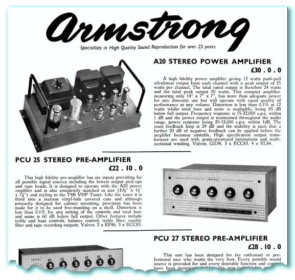
The above image shows an example of a typical two-sided leaflet from this period, featuring the A20 and other items from the start of the 1960's. Although the layout is more modern than the 1930's/1940's examples on the previous webpage, the basic approach is similar to before.
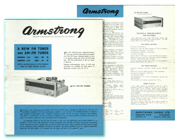
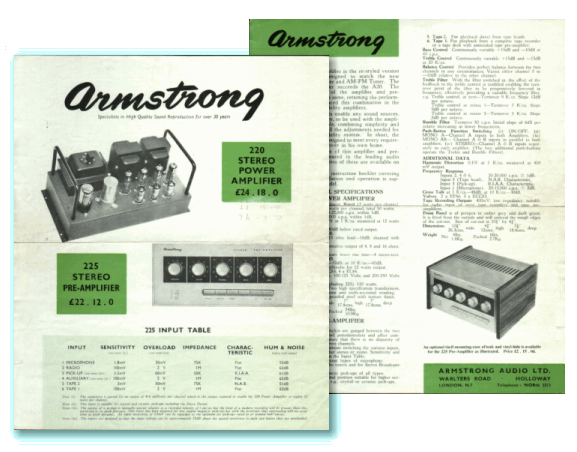
The big changes began around the time the 200 range was launched. The images above and below are from a pair of leaflets on the 200 range, produced in 1963. These use some bold blocks of 'spot' colours to liven up the presentation and make the appearance more attractive than plain monochrome. Interestingly, if you compare the photo of the 220 power amplifier shown on the left, below, with the one of the A20 at the top of this webpage you will find they are curiously similar. In fact, the 220 was essentially a revamped and renamed version of the A20, designed to fit into the new 200 range. This being the case, it seems quite likely that exactly the same photo was used for the 200 range ‘colour’ leaflet as for the A20 sheet, produced two or three years earlier! Also interesting is the drop in price from £30 for the A20 to £24/18/- (i.e. just under £25) for the 220.
From the 200 range onwards, the publicity material for later ranges became far more varied, imaginative, and colourful...

Content and pages maintained by: Jim Lesurf
using HTMLEdit and TechWriter on a StrongARM powered RISCOS machine.