BBC iPlayer versus the rest - Proms 2011
As in previous years the Proms provided an excellent opportunity to compare some of the ways the BBC convey audio to listeners. Alas, the scope of comparisons was hampered because of two unfortunate decisions by the BBC. Firstly, the BBC Trust sanctioned the removal of their UK-wide radio stations from DVB-T in Scotland during the late afternoon and evenings. (More precisely from 5pm on weekdays and 4pm at the weekend.) This means that in Scotland we are now denied the ability to listen to the Proms, live on R3, via DVB-T. Secondly, BBC Scotland have decided that we are not to be allowed to view the First Half of the Last Night on TV. Instead we get a ‘Scots’ Last Night (sic) on BBC TV.
Curiously, viewers across the entire UK do get a chance to view the ‘Scots’ Night as it is repeated on BBC4 TV. But those of us who live in Scotland aren’t given equivalent access to the missing part of the genuine event from the RAH. However this year I managed to widen the comparisons I did to cover DSAT (for the First Half of the Last Night) in addition to DVB-T (BBC1 Second Half), iPlayer R3 (320kbps stream), and DAB R3.
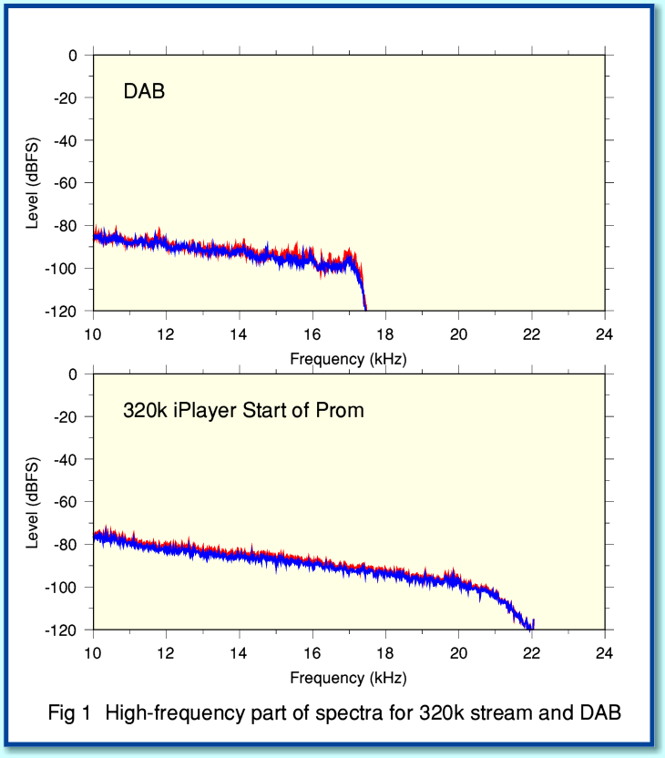
Figure 1 shows two spectra taken from 50-second chunks of the Last Night. One from the 320k iPlayer stream, the other from DAB, Note that here I’ve just plotted the high-frequency portion of the spectra to make the main difference between the two more obvious. Looking at the results you can clearly see that the DAB broadcast has a Low Pass Filter (LPF) applied with a cutoff at about 17kHz.
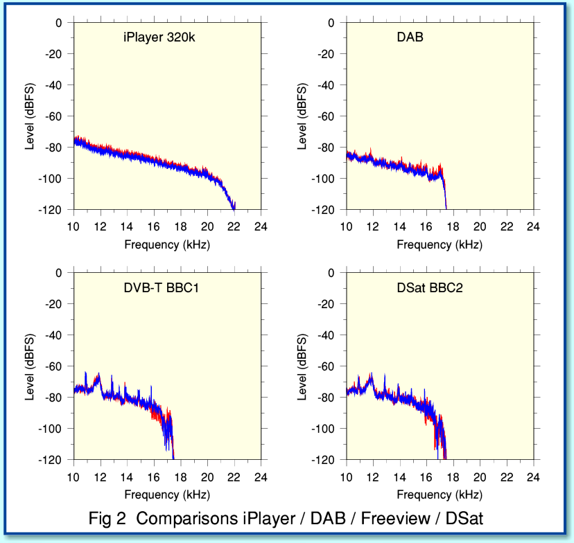
If we widen the comparison to also cover DVB-T (BBC1) and DSAT (BBC2) we find that the TV versions of the Last Night are also low-pass filtered, removing frequencies above 17kHz. At first discovery this behaviour seems odd. The iPlayer uses a sample rate of 44·1ksamples/sec, whereas DAB and the TV examples all use 48ksamples/sec. So on the face of it we’d expect the DAB and TV to offer a wider audio bandwidth than the iPlayer! I therefore discussed this with one or two people at the BBC. They explained that the LPF is deliberately applied by the MP2 coder. This is partly because they use a lower bitrate than the 320k iPlayer stream, and partly because MP2 is less efficient than the AAC coding used for the iPlayer. As a judgement call, therefore, the BBC feel it produces audibly better results for their MP2 audio to bandlimit the audio to 17kHz during MP2 encoding. (Note that I’m only considering the ‘Standard Definition’ TV broadcasts. The ‘High Definition’ ones currently use 320k AAC audio, but I haven’t yet had a chance to examine this!)
In essence this means that the MP2 data is focussed onto giving the most accurate representation it can of what is below 17kHz. Since I can’t say I’d ever noticed when listening that DAB and TV are bandlimited to 17kHz I can’t say I miss the suppressed HF much! And of course FM broadcasting always applies a 15-16kHz LPF without this causing widespread distress amongst listeners. One interesting aspect of this is that it underlines that the choice of codec, bitrate, and the way the information is handled may matter more to the audible quality of the end result than the choice of sample rate. Again, an interesting point given that the distribution by the BBC to their FM transmitters is based on a 32ksample/sec sample rate!
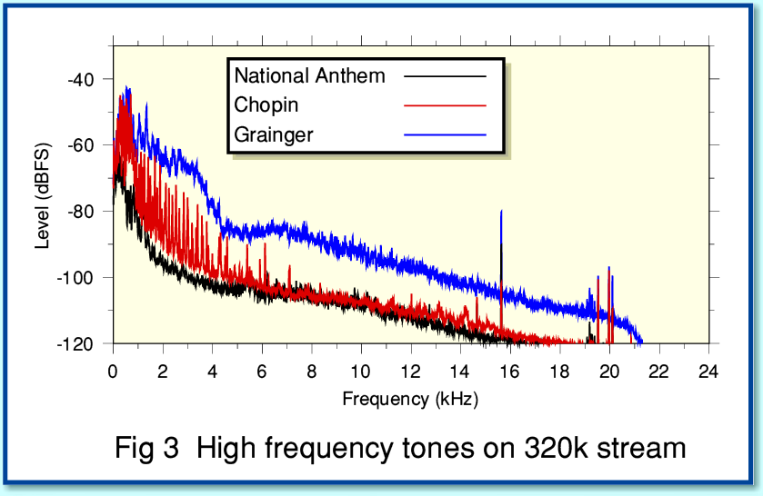
While looking at high frequency portion of the audio spectrum I noticed some other curious features. Figure 3 shows results for three, 50 second long, portions of the Last Night via the 320k iPlayer stream. Note that in my other graphs the red and blue lines represent the Left and Right stereo channels. But in Fig 3 the colours indicate the left channel for each of the chosen portions of the stream. I’ve also plotted the graphs with a linear frequency scale to make the details of the high frequency end of the spectrum more easily visible. Looking at the spectra you can see a set of tones in the region above about 14kHz. In general these come and go from one portion of the broadcast to another, and the frequencies involved change from time to time. But there is one component that seems to persist and become noticeable whenever the surrounding music (plus background noise) is at a quiet enough level to expose its presence.
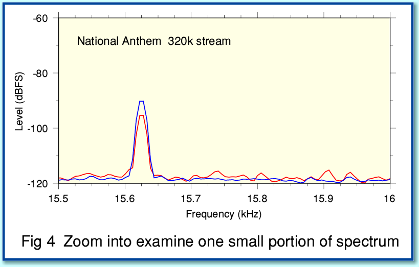
Figure 4 shows a “zoomed in” view on the region just above 15 kHz. This shows a component at 15·625 kHz which is present essentially throughout the broadcast.
Those familiar with Standard Definition UK TV will know it it based on 625 lines (rows) per frame at a rate of 25 frames per second. This means that with ye olde ‘analogue’ TV cameras and CRTs displays the ‘line scan frequency’ is/was 15·625 kHz. Hence when any such TV equipment is used near audio systems there is the risk that some 15·625 kHz tone may be injected into the audio. (Some of us will also know from annoying experiences that the same frequency can be audible from domestic analogue TV sets as capacitors or other components in a CRT system ‘sing’ at the line-scan frequency!)
I must admit I was surprised that this tone cropped up on the Proms broadcast as I’d assumed that all the TV equipment in the RAH would by now be ‘digital’ – so no more actual ‘line scanning’! However after talking to some people at the BBC I realised that CRT monitors, etc, may still be in use as they continue to work and give a good picture. Hence although the CRT may be vanishing from homes, it may still live on in studios and broadcast venues. Having found the line frequency tone I went back and checked my data for Proms from previous years, and yes, these also show line frequency tone, typically at the same sort of persistent low level.
More puzzling are the other tones which seem to appear and vanish and change with time. My first thought was that these might be some kind of ‘aliasing’ artefact of the frequency conversion or encoding processes. However simple artefacts of that kind tend to appear with a pattern that looks a little like a ‘mirror image’ of the actual audio at lower frequencies. And these tones don’t really look like that.
As in previous years, the BBC kindly provided me with some ‘from source’ copies of the broadcast so I could compare what I obtained from the iPlayer, etc, with what they were feeding into their distribution systems. This allowed me to do comparisons like the ones shown below.
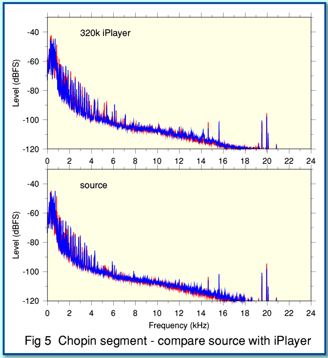
Figure 5 compares the source with the iPlayer for a 50 second segment from the start of the Chopin encore. The time alignment is only accurate to a second or so, hence the compared segments aren’t time-aligned precisely to the sample level. But you can see that the two spectra are quite similar, and show much the same pattern of high frequency tones. These HF tones also don’t ‘mirror’ the low frequency portions in any obvious way.
The source version provided was at 44·1k sample rate to match the iPlayer. This does potentially raise the possibility that there is a problem with the 48k to 44·1k conversions performed by the BBC. But that seems pretty unlikely, and the tones don’t provide evidence of a simple aliasing problem. So it seems more likely that the high frequency tones are coming from the RAH itself. What I can’t say is if they are some kind of electrical interference, or are due to mechanical causes. e.g. squeaky chairs or floorboards in the hall generating high frequency low-level tones that may pass unnoticed to the human ear but show up when the signals are analysed.
As chance would have it, I was looking though old copies of ‘Hi Fi News’ magazine doing research for another topic and found a mention of “singing lightbulbs” by Angus McKenzie in the October 1982 issue. On that occasion he and others found HF “whistles” above 14 kHz on a broadcast from the RAH. These turned out to be lightbulbs ‘singing’. So maybe it is a regular occurance for the lighting to sing along – albeit out of tune – with the music!
Overall, as with previous years, I’d say that the sound produced on the iPlayer was outstandingly good. The HF tones shown above can be found by generating spectra averaged over many seconds, but to me seem to audibly innocuous. However I had the impression that for at least some of the time the BBC1/2 versions sounded different. So I decided to compare the dynamics.
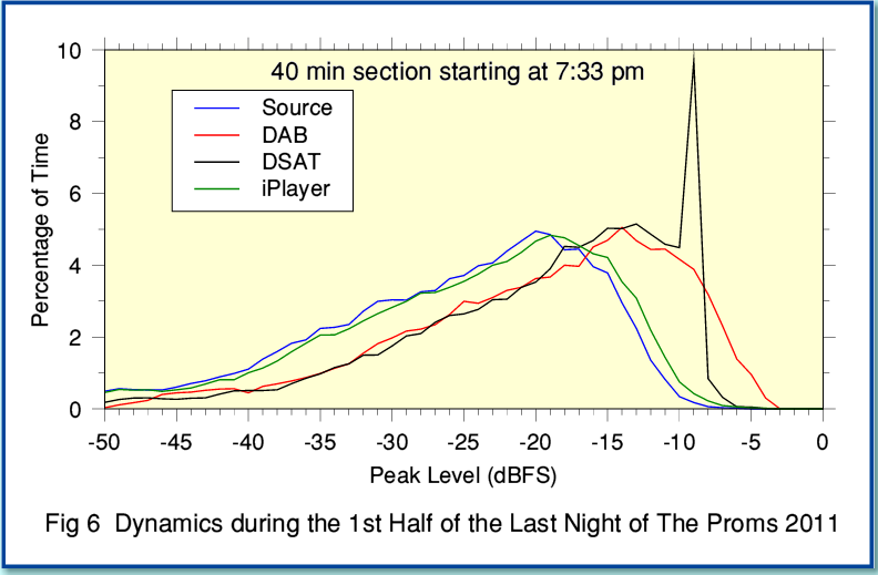
Figure 6 compares the source with DAB, iPlayer and DSAT (BBC2) versions during a 40 minute section of the first half of the Last Night. You can see that the DAB and iPlayer dynamics are very similar to the source. There is a slight change in overall level for iPlayer compared to source, and a somewhat larger change in overall level for DAB. There is also some sign that the DAB version is being slightly limited for a small portion of the time. This could probably have been avoided if the level for DAB were about 1 or 2dB lower. For obvious reasons judging this is difficult for a live event such as the Last Night. My feeling is that the iPlayer judged this better than DAB, but despite that I suspect that the limiting is slight.
From talking to the BBC I understand that the decision was taken about 18 months ago to slightly increase the audio levels on DAB. The reasoning is that there is no ‘Optimod’ compression on DAB, so a slightly higher level would make listening in cars and other noisy environments easier. The judgement (which I tend to share) is that any limiting is rare enough not to be a problem.
Above said, the most glaring difference is that the DSAT version exhibits a distinct ‘spike’. For this, the region around -10dBFS seems rather more ‘popular’ than for the source, etc! The impression is that around 6dB worth of level compression has been applied, and this has ‘scrunched together’ a 6dB range in the distribution into about 1dB.
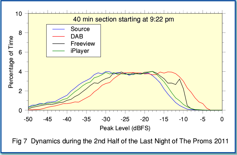
Figure 7 shows the results of a similar comparison during the second half. This time the TV version is from DVB-T (BBC1). The relative behaviours seem broadly similar to during the first half, but the ‘spike’ in the TV version isn’t so marked. This may be because the peaks aren’t reaching high levels so often – i.e. the overall gain for the TV sound has been wound down.
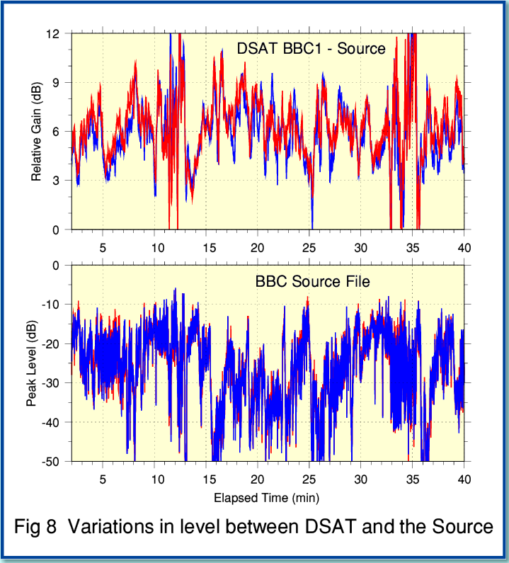
So what caused the differences in dynamics between the TV and other versions? And why did I have the impression that the TV version sounded slightly different? To investigate this I time-aligned two versions and compared their relative levels as time passed to obtain the results shown in Figure 8. For this I used the same 40 minute chunk of the first half that I used to get the results shown in Figure 6.
The lower graph in Figure 8 shows the variations in peak level for the (R3) source during the relevant period. The upper graph shows the difference in peak levels (DSAT minus source). Looking at this we can see that the apparent extra gain applied to the DSAT version is, overall, about 6dB, but that it wanders around as time passes. Typically it tends to move between 3dB and 9dB, with occasional brief excursions to a higher or lower difference in level. Comparing with the lower graph shows no obvious-to-the-eye correlation between these variations and the actual source level. The behaviour does not look like the action of an automated compressor that simply reacts to the input level. So out of curiosity I also compared the time-averaged spectra.
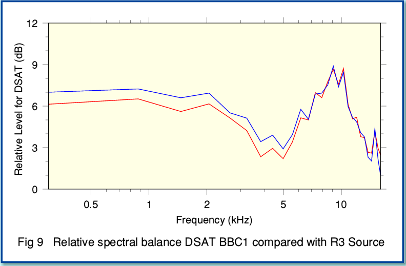
Figure 9 shows the relative levels for the left and right channel (red and blue) for DSAT compared with the source, but this time as a function of frequency. These results are time-averaged over the first 10 mins of the aligned periods above. Looking at Figure 9 we can clearly see a dip in the spectral response of around -3dB in the 3 - 5 kHz presence region, with a peak about 3dB in the 10kHz region. This ‘suckout’ in the 3 - 5 kHz region might perhaps be what made me feel the TV version ‘sounded different’. It may also explain some of the complex wanderings of the relative levels shown in the upper graph of Figure 8. This is because as the spectral content of the music varied the levels for DSAT would also alter compared to the (R3) source if the two versions are (frequency) balanced differently.
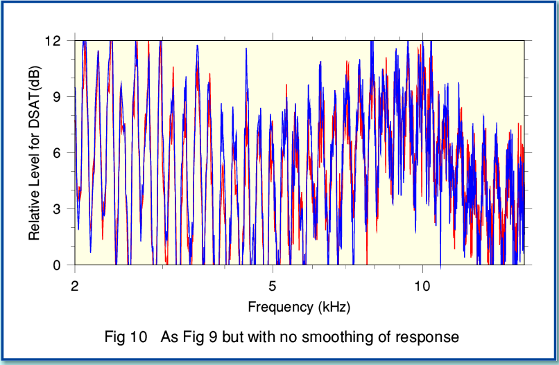
The results shown in Figure 9 have been ‘smoothed’ to give a frequency resolution for the graphs of around 600Hz. This was done to reduce the level of random variations with frequency and make the overall balance easier to observe. However the unsmoothed spectrum of the difference between DSAT and R3 source also showed a curious effect when examined with higher frequency resolution.
Figure 10 shows the DSAT - Source difference spectrum when no smoothing is applied. You can still see the general behaviour of a dip in the 3-5 kHz range and a peak around 10 kHz. But there is also an obvious ‘periodic’ pattern of peaks and dips varying more quickly with frequency.
This behaviour is a bit of a puzzle. What is the cause? Note that Fig 10 has a log-axis for the frequency. So these the change in frequency between adjacent peaks or dips actually seems to scale approximately with the frequency. i.e. the change in frequency between adjacent peaks at 10 kHz is actually about five times more than at 2 kHz. The result is the fairly periodic behaviour when examined with a log scale.
In my experience, variations of this kind tend to be a sign of a process that is taking a copy of the signal, and then adding (or subtracting) back after a time delay. The result is a peak at frequencies where the direct and delayed components add up in phase, and a dip at frequencies where they are 180 degrees out of phase. The frequency spacing between peaks (or dips) is a guide to the time delay involved. So a 1 ms delay would produce peaks 1 kHz apart, but with a 2 ms delay they would 500 Hz apart. Spaced microphones can do this when their outputs are combined. For example, if one microphone is a few feet further from the sound source than another the signal it collects will be delayed by a few milliseconds due to the extra time the sound takes to reach it.
However when a set of microphones are used to gather sound in stereo the whole point is that the sound sources are spread around them. That means that the time delays between microphones will vary from one sound source to another. Given an orchestra these effects for individual instruments will simultaneously produce a range of delays. However for a specific location they will tend to give a time delay independent of frequency. But I would not have expected this to give the result shown in Figure 10, with the curious behaviour of the peak separations in the spectra scaling with frequency, for the combined output of the orchestra, etc, spread around in space!
An alternative possibility is that the “delay and combine” is being applied by some form of filtering or processing. For example, a low pass filter may have a delayed feedback arrangement as part of its frequency-selective behaviour. And that may well produce a delay for the fed-back component that varies with frequency. Hence it seems possible that the above pattern of peaks and dips is due to some filtering or processing the TV audio is being run through. However I have no idea if this is the case. Nor – if it is – if the reason is the 17kHz LPF, or some other process related to the use of the MP2 system for audio! I did show the results to some people at the BBC, but they were also puzzled by the behaviour. So at present I can only present this result as a curio which I can’t at present explain! It is possible it is an artefact generated by the number-crunching I did to analyse the recordings. But if so, I haven’t yet found the cause and been able to correct it...
I also did a similar comparison of the iPlayer output with the source. But I have not presented the results as a graph here because they are so boring. They simply show an essentially flat response. So far as this aspect of behaviour is concerned, the 320k iPlayer stream is essentially transparent. No sign there of what can be seen in Figures 9 and 10.
Overall, the results do confirm what I have been told. This is that the BBC1 and BBC2 broadcasts collect their own sound independent of Radio 3. Deducing the details from the results is to some extent a ‘chicken and egg’ argument after the event. If someone was continually twiddling the sound level for TV then. as the music changed. this could produce a different time-averaged spectrum. But on the other hand, having set up a different tonal/microphone balance would alter the statistics of the dynamics. By listening I had the impression that the TV version did have a different tonal/microphone balance, and if so, that would also contribute to the discrepancy in dynamics. However the ‘spike’ in Figure 6 looks like a very strong indicator that noticeable amount of level adjusting is taking place. So it may well be that the TV side are both using their own balance and compressing the dynamics in some way.
My personal conclusion is that overall I tend to prefer the sound from the iPlayer to the other versions when I am simply listening to the music. (And the good news here is that when BBC4 TV transmit other Proms they use the same audio as Radio 3.) But that said, TV does have video, and the Last Night is a very special event which many enjoy via TV – even if some of us still tend to feel that “The pictures are better on the radio!”
Jim Lesurf
3100 Words
2nd Nov 2011